Static Television Graphics
Key Concepts
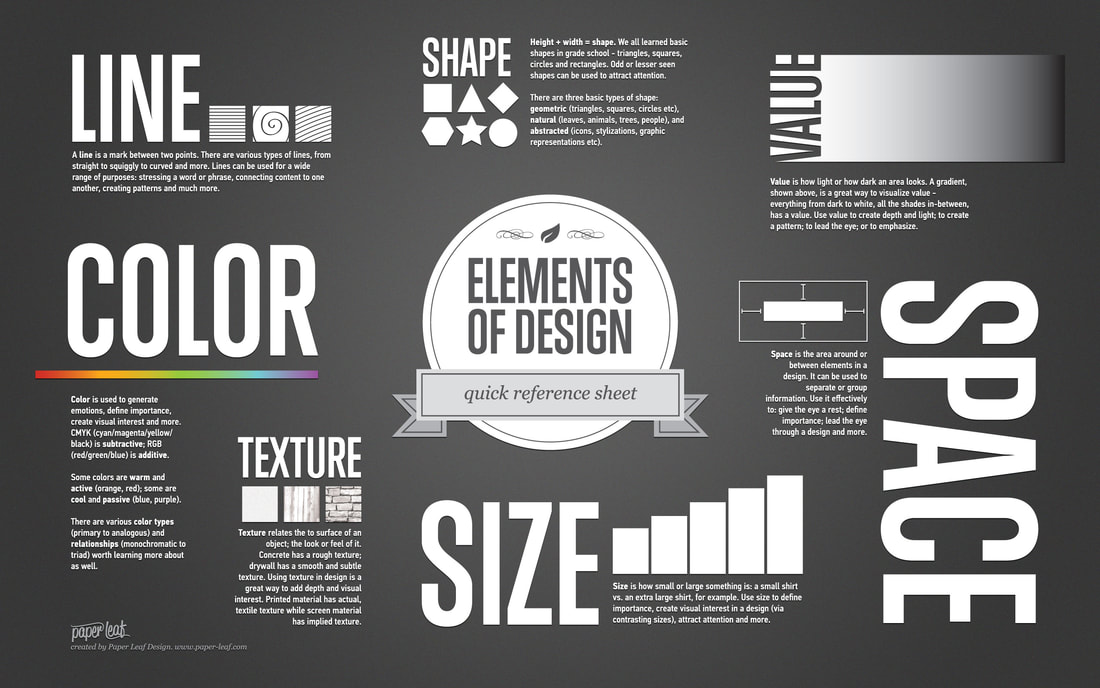
Rule of Thirds (dead centre is dead boring)
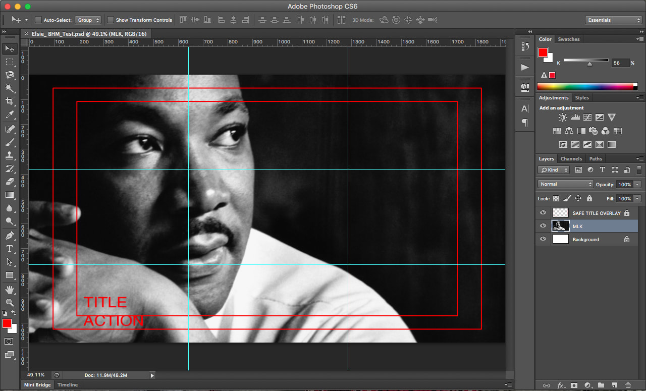
Safe Overlays
Tip: When designing graphics in Photoshop for later motion animation in After Effects you will need to rasterize any layer that you have added:
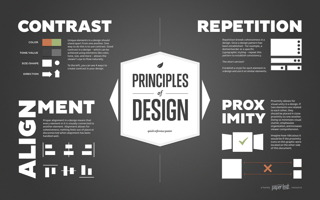
Design Elements and Principles:
Rule of Thirds (dead centre is dead boring)
Safe Overlays
- Title Safe - all text must fit within the title safe area
- Safe Action - all other important visual elements must fit within the safe action area
Tip: When designing graphics in Photoshop for later motion animation in After Effects you will need to rasterize any layer that you have added:
- Stroke
- Gradient
- Drop Shadows
Design Elements and Principles:
- Hierarchy - emphasis of elements - layout on page - use of space
- Placement/Alignment - balance of elements in relation to one another
- Scale - of elements in relation to one another
- Typography - font choice
- Colour - colour scheme - compliment vs. compete
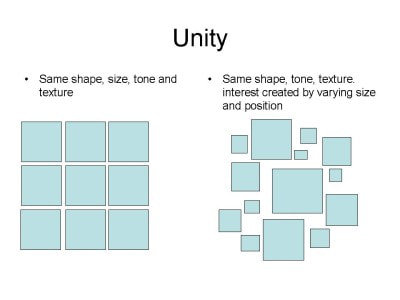
- Unity/Patterns/Repetition
|
|
|
|
|
|
Student Work Exemplars
The following student exemplars are examples of both level 3 and 4.
Following the Rules
1. Safe Overlays
2. Rule of Thirds
Assignment 1: TV Graphics Research & Black History Month - Lower Thirds TV Graphic - Photoshop (Static) Rubric
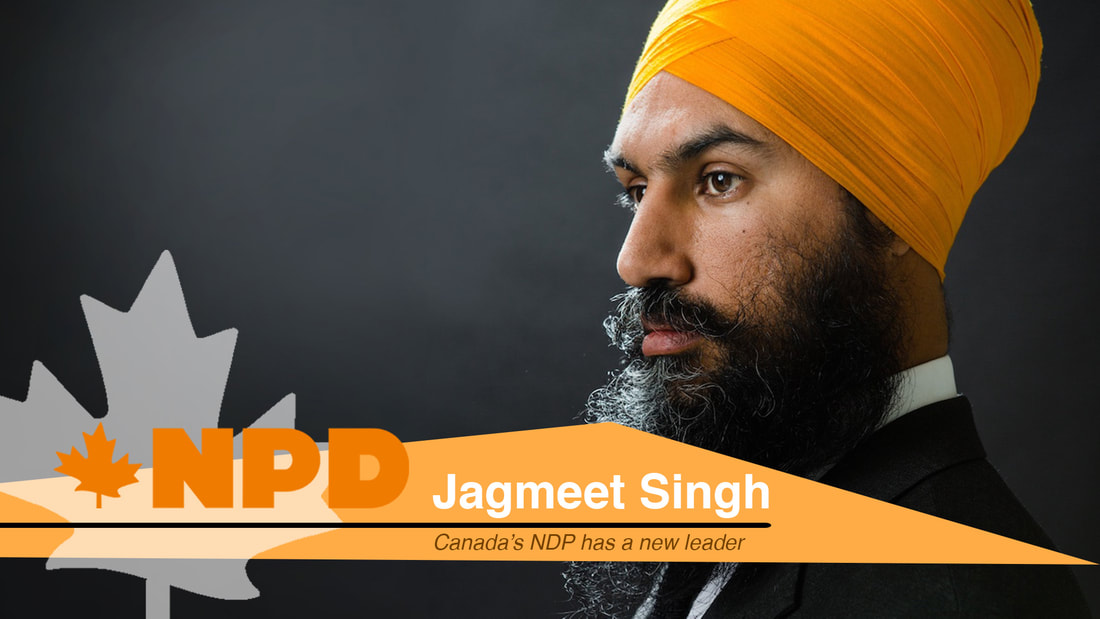
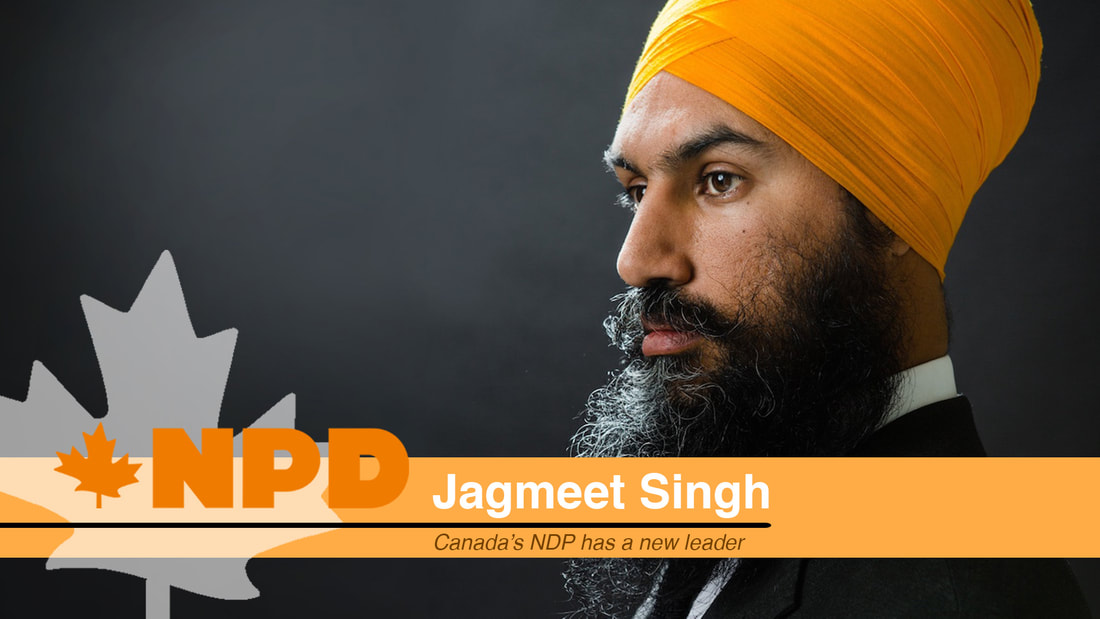
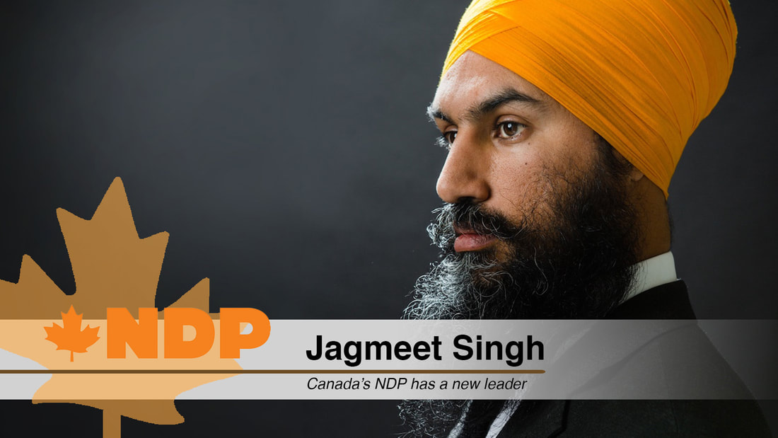
Assignment 2: Lower Thirds TV GFX

Assignment 2: Lower Thirds TV GFX with Title Safe and Safe Action Overlay
Gord Downie Photo Source: http://www.buffablog.com/wp-content/uploads/2014/07/SAS9055.jpg
Font Style and Sizes
GORD DOWNIE - Myriad Pro Semibold 48pt
Farewell - Myriad Pro Regular 19pt
THE - Myriad Pro Regular 48pt
H - Myriad Pro Regular 200pt
ip - Myriad Pro Regular 115pt
GORD DOWNIE - Myriad Pro Semibold 48pt
Farewell - Myriad Pro Regular 19pt
THE - Myriad Pro Regular 48pt
H - Myriad Pro Regular 200pt
ip - Myriad Pro Regular 115pt

Photoshop: How to setup Title Safe and Safe Action Overlay
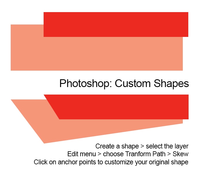
Photoshop: Creating Custom Shapes
Assignment 2: Inspirational Lower Thirds TV Graphic
Objective
Part 1 - Photoshop Graphic
In Photoshop, students will create a static graphic for high definition television based on the lessons, tools and techniques taught in class. Students will create a lower thirds television graphic based on an iconic inspirational figure in their life. Students must first develop a minimum of three layout design sketches that communicate two different layout ideas for their lower thirds graphic. The completed Photoshop graphic must include all four graphic elements; shapes, image, text and logo. In addition, a colour scheme for the graphic will be created. Remember, colours must complement not compete with all graphic elements and background image.
Part 2 - After Effects
In After Effects, students will animate the completed Lower Thirds TV graphic from Part 1. Students are required to animate each element of the graphic using the lessons, tools and techniques taught in class.
Requirements
Part 1 - Photoshop Graphic
________________________________________________________________________________________________________________________________
Peer Assessment Requirement
Hard Copy Submission to Teacher:
Objective
Part 1 - Photoshop Graphic
In Photoshop, students will create a static graphic for high definition television based on the lessons, tools and techniques taught in class. Students will create a lower thirds television graphic based on an iconic inspirational figure in their life. Students must first develop a minimum of three layout design sketches that communicate two different layout ideas for their lower thirds graphic. The completed Photoshop graphic must include all four graphic elements; shapes, image, text and logo. In addition, a colour scheme for the graphic will be created. Remember, colours must complement not compete with all graphic elements and background image.
Part 2 - After Effects
In After Effects, students will animate the completed Lower Thirds TV graphic from Part 1. Students are required to animate each element of the graphic using the lessons, tools and techniques taught in class.
Requirements
Part 1 - Photoshop Graphic
- 3 layout design sketches developed to communicate different lower thirds design layouts
- Includes “Title Safe and Safe Action Overlay” layer (video actions)
- Includes all four graphic elements as follows:
- 3 shapes minimum (1 shape acts as a text line separator)
- 1 logo minimum
- 2 lines of text minimum
- Alignment and position of graphic elements are organized lead the eye
- All graphic elements work well together as complete design
- Typography (font style and size) must complement the graphic elements and the chosen person of inspiration
- Colour scheme must complement the graphic elements and the chosen person of inspiration
- Main image of inspirational person must follow the “Rule of Thirds” and favour the left vertical line or be center aligned
- Downloaded images must be high quality (minimum of 1920 x 1080 pixels)
- No distortion or stretching of downloaded images
- Downloaded images must not include any graphic elements (ie: shapes, text, or logos)
- All layers must be given a name that identifies the layer content appropriately
________________________________________________________________________________________________________________________________
Peer Assessment Requirement
- Each student must peer assess a minimum of 1 other peers Inspiration Lower Thirds TV Graphic assignment. They must provide their peer with written or typed positive feedback as to some potential changes and edits to their design.
- Student peer feedback must reference all of the following:
- Hierarchy - what is the visual order of importance (“visual flow”)
- Scale
- Font scale - what information is most important?
- Image scale - large or small depending on the visual impact intended
- Font style
- Is the text legible? Serif or Sans Serif - use a maximum of 2 font styles in one design
- Colours
- Text and shapes
- Colours must compliment vs. compete (use Adobe colour to help).
- What is the inspiration for the colour choices?
- Placement and Alignment of design elements. Create an organized layout for visual flow
- Images and/or logos that connect to the topic of the graphic
- Graphics that are too complex often are hard for people to understand
- For example, 1 engaging image is always better than 3 or 4 images on a graphic
- Too my much text and the message gets lost in all the words - Write in phrases not sentences
Hard Copy Submission to Teacher:
- 3 layout design sketches of lower thirds graphic ideas
- Create your own folder on the server folder title your name
- Submit Photoshop file (.psd) and Photoshop PDF file (.pdf) in your folder
- Files named as “Student Name_Lower Thirds Inspire TV GFX”
- 1 x peer assessment (written or typed) of their final design.
Sketches - Layout Designs
Assignment Rubric
Photoshop Tutorial: REFINE EDGE & QUICK SELECTION
Source: Blue Lightning TV Photoshop
