Graphic Design - Key Concepts
Key Concepts
Keep it Simple (KIS)
- When designing, choose simple shapes, logos, and designs to inspire you to develop your own graphics
- Use outlined or silhouetted simple shapes, logos, and designs (seen below)
- Use the Pen Tool in Photoshop to create your own versions of the above simple shapes, logos, and designs you have researched and downloaded from the internet
- Dead centre is dead boring
- Title Safe - all text must fit within the title safe area
- Safe Action - all other important visual elements must fit within the safe action area
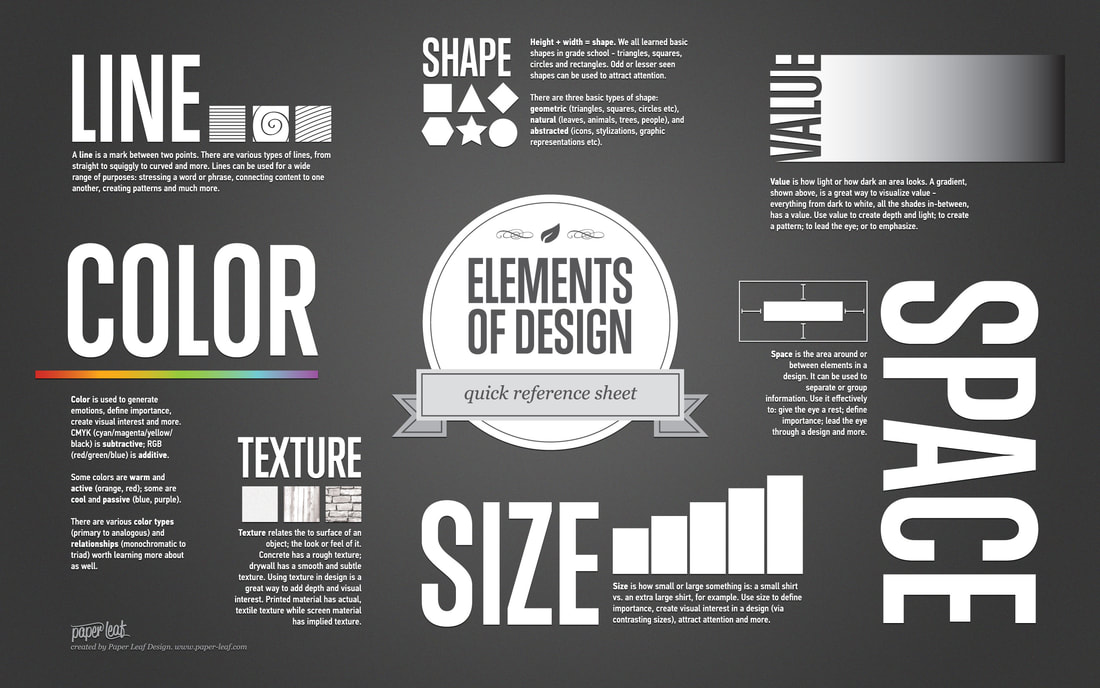
- Made up of: Shapes, Images, Text and Colour
Tip: When designing graphics in Photoshop for later motion animation in After Effects you will need to rasterize any layer that you have added:
- Stroke
- Gradient
- Drop Shadows
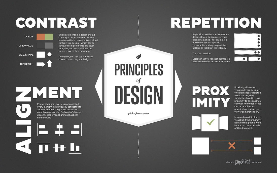
Design Elements and Principles
- Hierarchy - emphasis of elements - layout on page - use of space
- Placement/Alignment - balance of elements in relation to one another
- Scale - of elements in relation to one another
- Typography - font choice
- Colour - colour scheme - compliment vs. compete
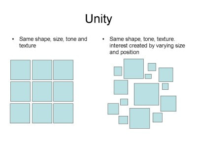
- Unity/Patterns/Repetition
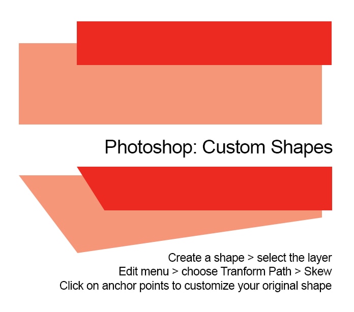
Creating Simple Custom Shapes
Creating a Colour Scheme
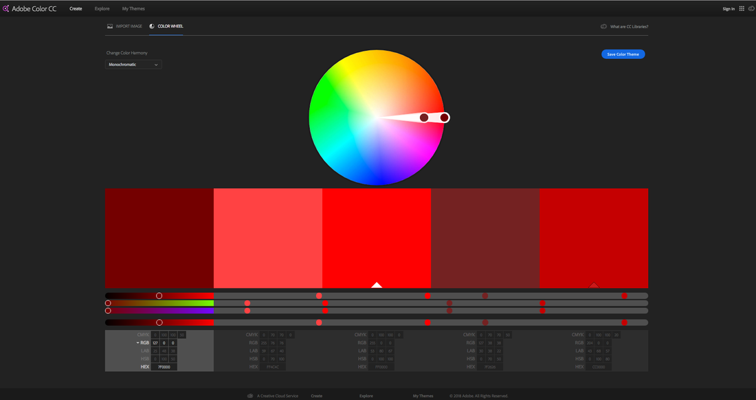
Here is a very helpful tool:
Adobe Colour Wheel color.adobe.com/create/color-wheel/
The best place to start with colour is research. Find designs online that you really like the chosen colour schemes. Use these as a guide and reference for your learning. Colour is very challenging.
When using Adobe Colour Wheel it would be best to try to use Monochromatic and Shades as
Colour Harmony options until you feel you understand colour a little better to try Complementary or other advanced options.
|
|
|
|
|
|
